Vector vs. Raster Graphics: Why It Matters for DTF Printing
Understanding the difference between vector and raster graphics can make or break your DTF prints. Learn when to use each format and how they impact your final product quality.
Vector vs. Raster Graphics: Why It Matters for DTF Printing
When you're getting into custom printing—especially with DTF (Direct-to-Film)—one thing that can make or break your final product is the kind of file you're working with. I've seen plenty of people bring in great designs that just don't translate well because the file type wasn't right.
If you're running a small print shop, designing your own merch, or just curious about how this works, here's the breakdown of raster vs. vector graphics, why they matter, and how to make sure you're setting yourself up for success.
Raster Graphics: Pixel Power with Limitations
A raster image is made up of tiny squares of color—pixels. Every photograph you take with your phone or camera? Raster. Most images you pull from the internet? Also raster.
They're great when you want detail—things like photographs, AI-generated art, or complex gradients that blend smoothly from one color to another. But here's the catch: once you scale them up, those tiny pixels start to show, and you end up with blurry edges. That's why blowing up a small JPEG usually looks terrible.
Where rasters shine:- Photo-based designs
- Detailed shading or painted effects
- Final, full-color print-ready artwork
Vector Graphics: Crisp, Clean, and Scalable
A vector file is built with paths and mathematical equations instead of pixels. That means you can resize it to fit a coffee mug or a billboard, and it'll stay perfectly sharp.
Vectors are a dream to edit. Need to change the color of just the shirt in a logo? No problem. Want to make the text a little bigger? Two clicks and it's done.
Where vectors shine:- Logos
- Text-heavy designs
- Simple illustrations and shapes that need to scale perfectly
Why File Type Matters in DTF Printing
Yes, you can technically print both raster and vector files in DTF. But the quality, ease of editing, and overall look of the finished product can vary a lot.
If you start with a vector, you've got the flexibility to tweak sizing, colors, and layout without worrying about losing sharpness. That's huge when you're doing things like team jerseys, branded apparel, or anything with fine lines.
Rasters can still look great—especially for full-color photo prints—but they require more care. You want to start with the highest resolution possible and avoid scaling them up too much before print.
A Real-World Example
I've had clients bring me a "logo" that was really just a screenshot from their website. It looked fine online, but as soon as we blew it up for a t-shirt, it turned into a pixelated mess.
On the flip side, when someone sends me a proper vector file, it's a breeze—clean edges, easy color swaps, and no quality loss no matter how big we make it.
How I Use Both in My Business
In my event management and race timing company, we do a lot of t-shirt printing for races, and the file format really makes a difference in how clean the final product looks.
On the back of race shirts, we usually have a lineup of sponsor logos. The easiest way to work with those is when a company supplies their vector graphic. That's because, for consistency's sake, we'll often convert their logo to a one-color application. This helps the back of the shirt feel cohesive instead of looking like someone just threw a bunch of random logos on there. A consistent color palette creates a cleaner, more professional aesthetic.
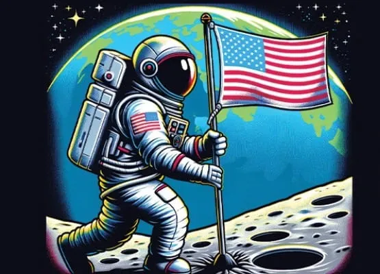
On the other hand, we use raster graphics quite a bit when we're putting detailed artwork on the front of a shirt. For example, in our recent Retro Run 5K, the design featured an astronaut standing on the moon holding an American flag. We could have built that as a vector, but instead, we used AI art generation to quickly and affordably create the image. Then we applied a halftone effect (something we covered in our Tips & Tricks section) to give it a vintage, screen-printed feel. That bold, artistic front design paired perfectly with the clean, one-color sponsor logos on the back—showing exactly how both raster and vector graphics can work together in the DTF world.
Pros and Cons at a Glance
Vector ✅ Infinite scalability ✅ Easy to edit ✅ Crisp, clean edges ❌ Not ideal for realistic photo-style images Raster ✅ Perfect for photos and complex gradients ✅ Rich, detailed color ❌ Can get blurry when resized ❌ Harder to edit without quality lossRaster vs. Vector Quick Comparison Table
| Category | Raster Graphics | Vector Graphics |
|---|---|---|
| How It's Made | Composed of pixels (tiny colored squares) | Built from paths and mathematical equations |
| Scalability | Loses quality when enlarged (pixelation) | Infinite scalability without quality loss |
| Detail Level | Handles complex details, gradients, and photographic textures | Best for clean lines, shapes, and solid colors |
| Editing | Limited — changing colors or shapes can be difficult without affecting quality | Highly editable — individual elements can be resized, recolored, or adjusted easily |
| File Size | Can be large if high-resolution; size increases with resolution | Usually smaller file sizes, even for complex designs |
| Common File Types | .JPG, .PNG, .GIF, .TIFF, .BMP | .AI, .EPS, .SVG, .PDF (vector-based), .CDR |
| Best Uses | Photographs, detailed illustrations, AI-generated art, complex color blending | Logos, icons, typography, simple illustrations, scalable designs for apparel or signage |
| DTF Printing Fit | Works well for photo-heavy designs but needs high resolution to avoid blur | Ideal for sharp, clean designs that may need resizing or color changes before print |
| Example Scenario | Printing a realistic portrait on a hoodie | Printing a crisp, multi-sized company logo on different shirt sizes |
Tips for Choosing the Right Format
- Start with vector whenever possible, especially for logos, text, and simple illustrations.
- Keep original files—never work from screenshots or low-res copies.
- Know when to use raster—for photos, painted designs, and complex tonal work.
- Consider hybrid designs—vector for the main elements, raster for any photographic parts.
Final Thoughts
The difference between raster and vector isn't just a technical detail—it's the difference between a sharp, professional print and one that looks like it came from the bargain bin.
If you're getting into DTF printing, learning to recognize these file types and knowing which one to use will save you time, money, and frustration. Your designs (and your customers) will thank you.
About the Author
Darrin DeTorres
Founder & DTF Expert