Comfort Colors Shirt Colors: The Complete 1717 Color Guide
See every Comfort Colors 1717 shirt color, how the garment-dyed shades look, and which colors work best for DTF transfers.
Comfort Colors makes its 1717 heavyweight tee in more colors than most blank brands, and because every shirt is dyed after it is sewn, the colors look softer and less uniform than a standard dyed tee. This guide lists every current 1717 color by family, explains how the garment-dyed shades look in person, and shows which colors suit DTF transfers. For fit and measurements, see the Comfort Colors size chart.
What colors do Comfort Colors shirts come in?
Comfort Colors 1717 shirts come in 68 garment-dyed colors, according to the S&S Activewear listing we checked on November 11, 2026, from neutrals like White, Black, Pepper and Granite to blues, greens, warm tones, pastels and five neons. Pigment-dyed colors have a soft, slightly faded look, and the range changes as colors are added and retired.
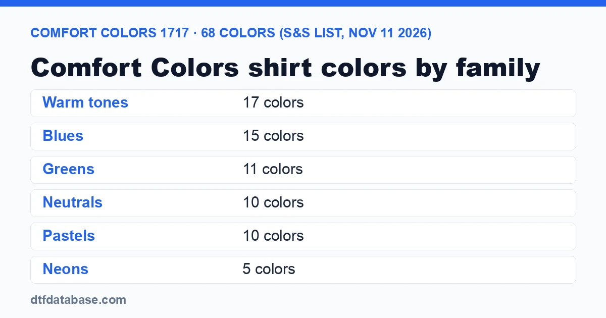
By family, the 68 colors break down as 15 blues, 17 warm tones (reds, oranges, yellows, pinks and purples), 11 greens, 10 neutrals, 10 pastels and 5 neons. The family grouping is ours; Comfort Colors does not publish one.
Comfort Colors 1717 color list
Where this list comes from. Comfort Colors' own product page is a JavaScript app that did not return its color list when we checked, and the brand's retail page (retail.comfortcolors.com, run by parent company Gildan Brands) shows only 24 swatches. The complete list below is the 68-color listing on the S&S Activewear 1717 page, checked November 11, 2026, with names spelled the way S&S spells them. Blankstyle's 1717 page showed 69 colors on the same day: the same 68 plus "Lagoon Blue," which S&S lists as Lagoon. Check your distributor before ordering, because colors are added and retired during the year.| Color | Family | DTF note |
|---|---|---|
| White | Neutral | Light: suits dark artwork; give white artwork an outline. Reactive-dyed (S&S) |
| Ivory | Neutral | Light: suits dark artwork; give white artwork an outline |
| Sandstone | Neutral | Light: suits dark artwork; give white artwork an outline |
| Khaki | Neutral | Light: suits dark artwork; give white artwork an outline |
| Grey | Neutral | Light: suits dark artwork; give white artwork an outline |
| Granite | Neutral | Mid tone: check light-ink contrast on a mockup first |
| Graphite | Neutral | Dark: colors sit on the white underbase; white and bright artwork stand out. Reactive-dyed (S&S) |
| Pepper | Neutral | Dark: colors sit on the white underbase; white and bright artwork stand out |
| Espresso | Neutral | Dark: colors sit on the white underbase; white and bright artwork stand out |
| Black | Neutral | Dark: colors sit on the white underbase; white and bright artwork stand out. Reactive-dyed (S&S) |
| Chambray | Blue | Light: suits dark artwork; give white artwork an outline. Moving to pigment dye, so shade can differ between lots (S&S) |
| Blue Jean | Blue | Mid tone: check light-ink contrast on a mockup first |
| Denim | Blue | Dark: colors sit on the white underbase; white and bright artwork stand out |
| Washed Denim | Blue | Mid tone: check light-ink contrast on a mockup first. Moving to pigment dye, so shade can differ between lots (S&S) |
| Flo Blue | Blue | Mid tone: check light-ink contrast on a mockup first |
| Lagoon | Blue | Mid tone: check light-ink contrast on a mockup first. Moving to pigment dye, so shade can differ between lots (S&S) |
| Royal Caribe | Blue | Mid tone: check light-ink contrast on a mockup first |
| China Blue | Blue | Mid tone: check light-ink contrast on a mockup first. Reactive-dyed (S&S) |
| Sapphire | Blue | Dark: colors sit on the white underbase; white and bright artwork stand out. Reactive-dyed (S&S) |
| Mystic Blue | Blue | Dark: colors sit on the white underbase; white and bright artwork stand out. Reactive-dyed (S&S) |
| Yankey Blue | Blue | Mid tone: check light-ink contrast on a mockup first |
| Dusk | Blue | Mid tone: check light-ink contrast on a mockup first |
| True Navy | Blue | Dark: colors sit on the white underbase; white and bright artwork stand out. Reactive-dyed (S&S) |
| Navy | Blue | Dark: colors sit on the white underbase; white and bright artwork stand out |
| Midnight | Blue | Dark: colors sit on the white underbase; white and bright artwork stand out. Reactive-dyed (S&S) |
| Bay | Green | Light: suits dark artwork; give white artwork an outline |
| Seafoam | Green | Light: suits dark artwork; give white artwork an outline |
| Island Reef | Green | Light: suits dark artwork; give white artwork an outline |
| Light Green | Green | Light: suits dark artwork; give white artwork an outline |
| Citrus | Green | Mid tone: check light-ink contrast on a mockup first |
| Island Green | Green | Mid tone: check light-ink contrast on a mockup first. Moving to pigment dye, so shade can differ between lots (S&S) |
| Sage | Green | Mid tone: check light-ink contrast on a mockup first. Reactive-dyed (S&S) |
| Hemp | Green | Mid tone: check light-ink contrast on a mockup first |
| Moss | Green | Dark: colors sit on the white underbase; white and bright artwork stand out |
| Emerald | Green | Dark: colors sit on the white underbase; white and bright artwork stand out |
| Blue Spruce | Green | Dark: colors sit on the white underbase; white and bright artwork stand out |
| Mustard | Warm | Mid tone: check light-ink contrast on a mockup first |
| Bright Orange | Warm | Mid tone: check light-ink contrast on a mockup first |
| Burnt Orange | Warm | Mid tone: check light-ink contrast on a mockup first |
| Yam | Warm | Mid tone: check light-ink contrast on a mockup first |
| Terracotta | Warm | Mid tone: check light-ink contrast on a mockup first. Moving to pigment dye, so shade can differ between lots (S&S) |
| Paprika | Warm | Mid tone: check light-ink contrast on a mockup first. Reactive-dyed (S&S) |
| Brick | Warm | Dark: colors sit on the white underbase; white and bright artwork stand out |
| Chili | Warm | Dark: colors sit on the white underbase; white and bright artwork stand out. Reactive-dyed (S&S) |
| Red | Warm | Mid tone: check light-ink contrast on a mockup first. Reactive-dyed (S&S) |
| Crimson | Warm | Dark: colors sit on the white underbase; white and bright artwork stand out |
| Wine | Warm | Dark: colors sit on the white underbase; white and bright artwork stand out |
| Bright Salmon | Warm | Mid tone: check light-ink contrast on a mockup first |
| Watermelon | Warm | Mid tone: check light-ink contrast on a mockup first |
| Crunchberry | Warm | Mid tone: check light-ink contrast on a mockup first |
| Berry | Warm | Mid tone: check light-ink contrast on a mockup first |
| Violet | Warm | Mid tone: check light-ink contrast on a mockup first |
| Grape | Warm | Dark: colors sit on the white underbase; white and bright artwork stand out |
| Butter | Pastel | Light: suits dark artwork; give white artwork an outline |
| Peachy | Pastel | Light: suits dark artwork; give white artwork an outline |
| Melon | Pastel | Light: suits dark artwork; give white artwork an outline |
| Blossom | Pastel | Light: suits dark artwork; give white artwork an outline |
| Rose Quartz | Pastel | Light: suits dark artwork; give white artwork an outline |
| Orchid | Pastel | Light: suits dark artwork; give white artwork an outline |
| Hydrangea | Pastel | Light: suits dark artwork; give white artwork an outline |
| Periwinkle | Pastel | Light: suits dark artwork; give white artwork an outline |
| Ice Blue | Pastel | Light: suits dark artwork; give white artwork an outline |
| Chalky Mint | Pastel | Light: suits dark artwork; give white artwork an outline |
| Neon Lemon | Neon | Neon: S&S says neons are more heat-sensitive; press at the low end of the cotton range |
| Neon Cantaloupe | Neon | Neon: S&S says neons are more heat-sensitive; press at the low end of the cotton range |
| Neon Red Orange | Neon | Neon: S&S says neons are more heat-sensitive; press at the low end of the cotton range |
| Neon Pink | Neon | Neon: S&S says neons are more heat-sensitive; press at the low end of the cotton range |
| Neon Violet | Neon | Neon: S&S says neons are more heat-sensitive; press at the low end of the cotton range |
The 24 colors on the Comfort Colors retail page are White, Denim, Granite, Black, True Navy, Chambray, Lagoon Blue, Island Reef, Berry, Flo Blue, Violet, Seafoam, Crimson, Bright Salmon, Blue Spruce, Pepper, Neon Red Orange, Light Green, Grey, Ice Blue, Butter, Crunchberry, Chalky Mint and Watermelon. Every one of them is in the table above.
How do garment-dyed colors look different from printed-on-screen swatches?
A Comfort Colors shirt is sewn first and dyed afterward, so the dye settles unevenly into seams, collars and hems, and the color varies a little from shirt to shirt. A swatch on a screen shows one flat color; the shirt in your hand has a washed, lived-in look with slightly darker seams.
The brand and its distributors spell this out:
- Pigment-dyed colors give "a vintage look," per the Comfort Colors retail page, while reactive-dyed colors give what it calls "a traditional dyed appearance." S&S marks twelve current colors as reactive-dyed: Black, Chili, China Blue, Graphite, Midnight, Mystic Blue, Paprika, Red, Sage, Sapphire, True Navy and White.
- Shade varies between batches. S&S's listing states that "Shade variations are inherent in the pigment dye process." For a group order, order every shirt in one color at the same time so they come from the same dye lot.
- Some colors are changing dye type. S&S notes that Chambray, Island Green, Lagoon Blue, Terracotta and Washed Denim (plus Banana, not on the current list) are moving from reactive or direct dye to pigment dye, and that stock will be mixed during the change. Two shirts in the same color name can look different until it finishes.
- The shirts are pre-shrunk. Comfort Colors says the 1717 is pre-shrunk during the garment dye and wash processes "for almost no shrinkage."
The 1717 is 100% ring-spun cotton at 6.1 oz per square yard, according to the S&S listing, in sizes S to 4XL.
Which Comfort Colors shirt colors work best for DTF transfers?
Every 1717 color takes a DTF transfer, because the shirt is 100% cotton and a DTF print brings its own white ink layer. The choice is about contrast and look, not adhesion:
- Dark colors (Black, Pepper, True Navy, Midnight, Blue Spruce, Espresso) give the most contrast for white, neon and bright artwork. The faded look of Pepper and Graphite suits vintage designs.
- Light colors and pastels (White, Ivory, Butter, Chalky Mint, Blossom, Ice Blue) suit dark artwork. White or very light artwork needs a dark outline or background shape to read on them.
- Mid tones (Granite, Flo Blue, Sage, Mustard, Watermelon) are where artwork most often disappears. Mock up the design on the actual color before ordering.
- Neons are, in S&S's words, "more heat-sensitive," and S&S advises the lowest effective temperature and dwell time when printing them. Press neons at the low end of the cotton range.
Looking for a transfer maker? The DTF supplier directory lists suppliers by state, and our guide to the best shirt colors for DTF transfers compares Comfort Colors with other blanks.
Comfort Colors sizes
Colors and sizes are separate questions. The 1717 runs S to 4XL with a relaxed, boxy fit; a medium is 20.25 inches across the chest. Our Comfort Colors size chart has every measurement in inches and centimeters, and the Comfort Colors vs Gildan vs Bella+Canvas sizing guide compares it with other blanks.
Frequently asked questions
How many colors does the Comfort Colors 1717 come in?
The S&S Activewear listing showed 68 colors for the Comfort Colors 1717 on November 11, 2026, and Blankstyle showed 69. Retailer counts vary because each stocks a different part of the range.
What is the most popular Comfort Colors color?
Comfort Colors does not publish sales by color. The 24 colors shown on its own retail page, including White, Black, Pepper, Granite, True Navy and Chambray, are the ones the brand chooses to feature.
Is Pepper a black or a gray?
Pepper is a faded charcoal: darker than Granite and Grey, lighter and softer than Black. It reads as a washed-out black from a distance.
Why does my Comfort Colors shirt not match the website color?
Garment dyeing makes every batch slightly different, and a screen can't show the washed texture. S&S states that shade variation is inherent in the pigment dye process. Order all shirts for one group in a single order.
Written by Darrin DeTorres, DTF Database founder. AI helped research and draft this page; every figure was checked against the named sources before publishing.Tags
About the Author
DTF Database Founder
Darrin DeTorres has over 10 years of experience in the print industry, specializing in screen printing, sublimation, embroidery, HTV, and DTF printing. He runs Notice Me Marketing and Media, a custom apparel production company that prints thousands of shirts per month.
More from DTF Basics
Explore DTF Database
Browse and compare 20+ verified DTF printer models by price, features, and specifications.
Read moreCalculate your per-print costs, profit margins, and ROI for DTF printing.
Read moreBrowse verified DTF suppliers for ink, film, powder, and equipment.
Read moreFind DTF transfer suppliers shipping to your state, with verified turnaround times.
Read moreMetro-level DTF supplier guides for Los Angeles, NYC, Dallas, Houston, and more.
Read moreStep-by-step guide to the DTF printing process with temperatures and troubleshooting.
Read more